Client
Self-Initiated
Services
Graphic Design, Illustration
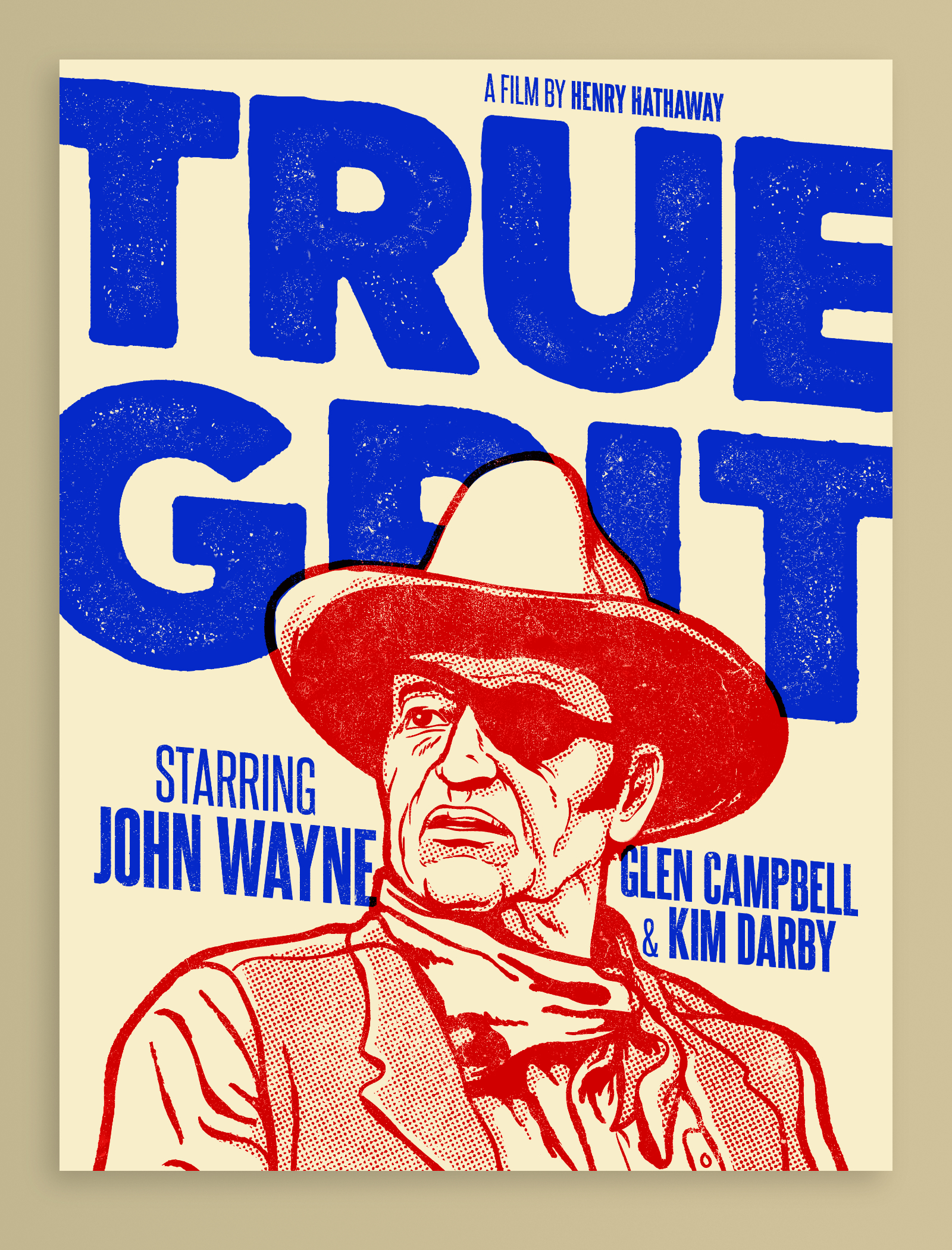
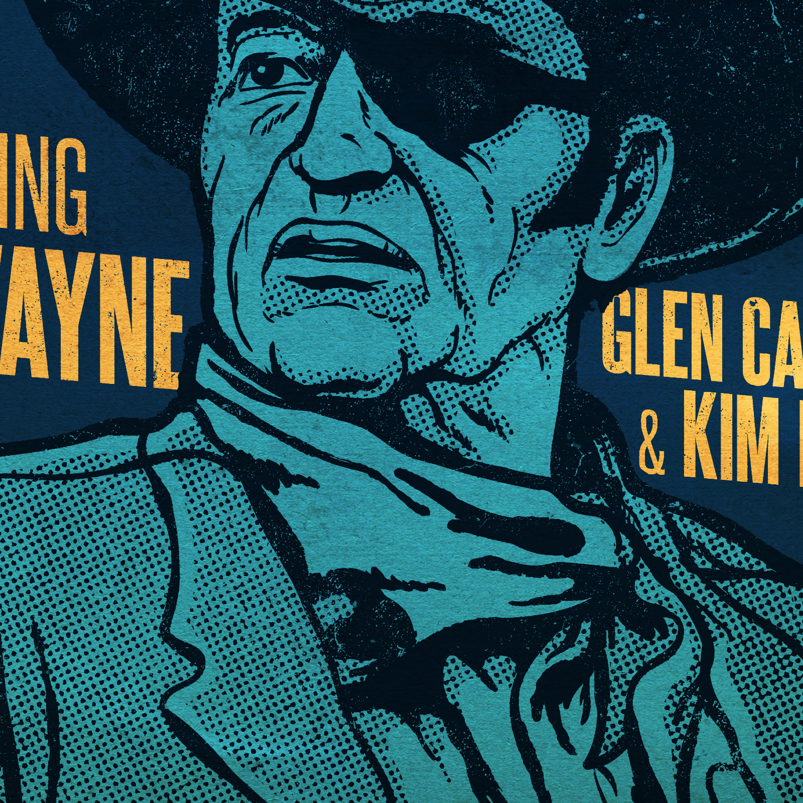
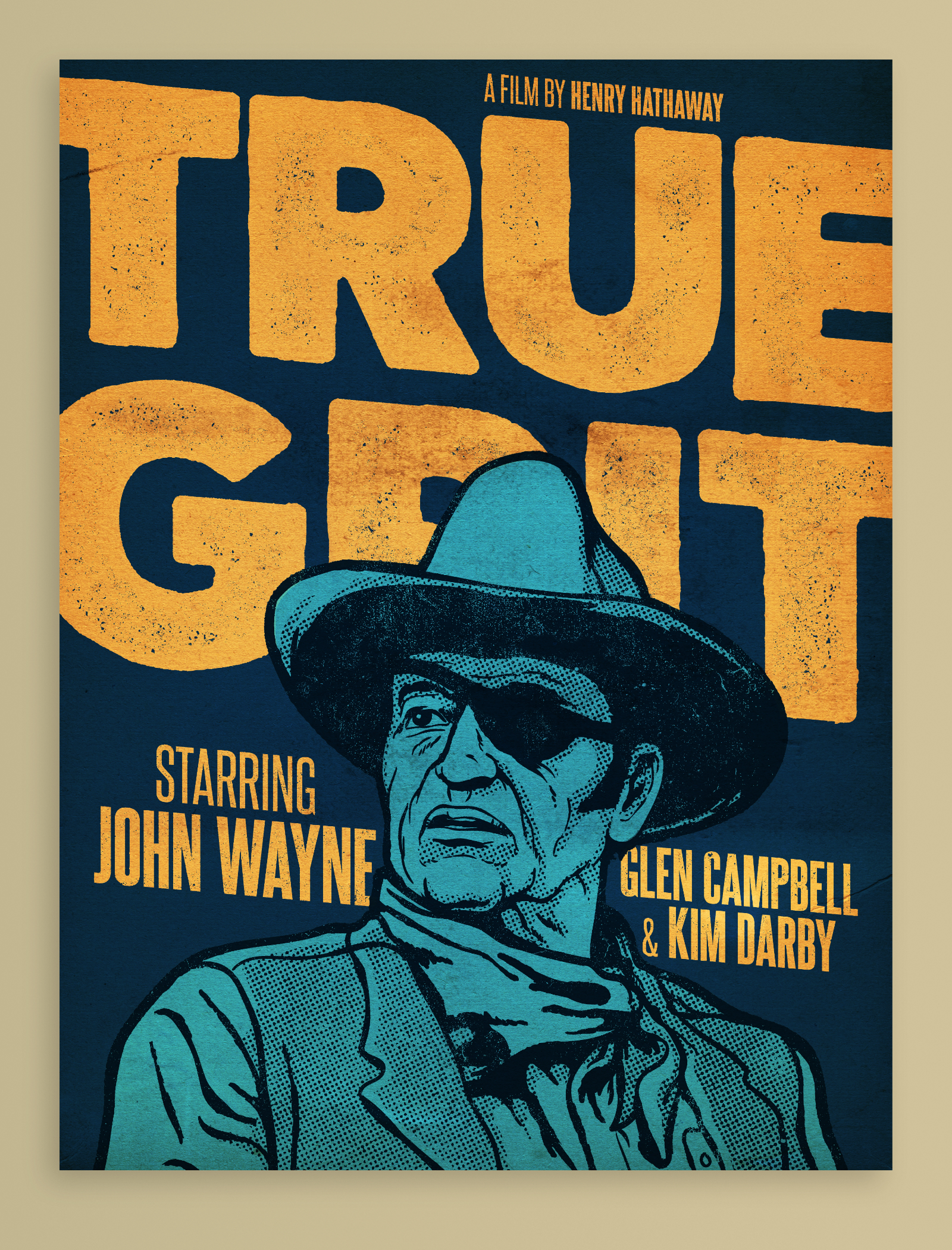
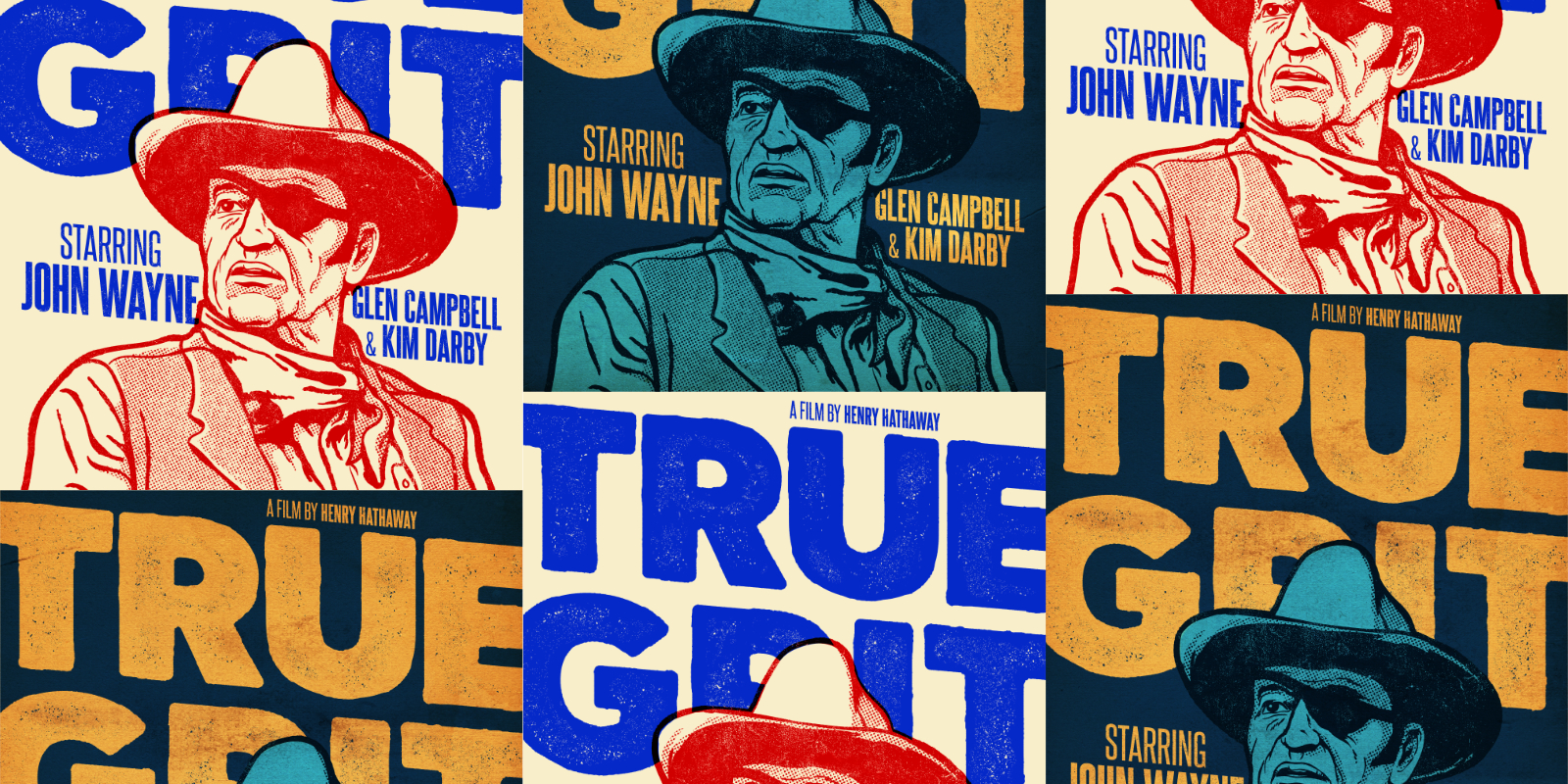
This was an exercise in expanding my use of texture, not only to make a piece look aged, but as a method of shading illustration work as well. The goal was to make it look screen printed with a very limited color palette. I used Illustrator to draw John Wayne and lay out the text, then brought everything into Photoshop to add the textures. I love playing with color combinations, so I ended up with a “day” and “night” version of the poster.
I was honored when Andrew Fairclough, who runs the always awesome Kindred Studio, chose my design as the first winning entry for his class on Skillshare. He also included this project with some other great work in this article on Skillshare’s blog.
