During my time as the in-house graphic designer for Asbury Church in Tulsa, OK, I had the opportunity to develop a proposed rebrand for the church.
Asbury is a large, established church with more than 50 years of history and a congregation made up of all age groups, so this project posed a unique challenge: How do you create a visual brand attractive to new congregants made up of young families and college-age adults while being sensitive to the older generations who still make up a good percentage of the church?
The goal was to change the perception of Asbury as being only a traditional church for an older demographic.
Giving Asbury a Refresh
There was room to improve the graphic alignment of Asbury’s identity with the vision, direction, and focus of the church. The goal was to change the perception of Asbury as being only a traditional church for an older demographic. We wanted to refresh the way the church presented itself to face the future while paying respects to its roots. I’ve learned one of the best ways to show respect for such a varied group of people—and get buy-in for a big initiative—is to be very thoughtful about symbolism and explain my design choices methodically.
Designing a Shape with Meaning
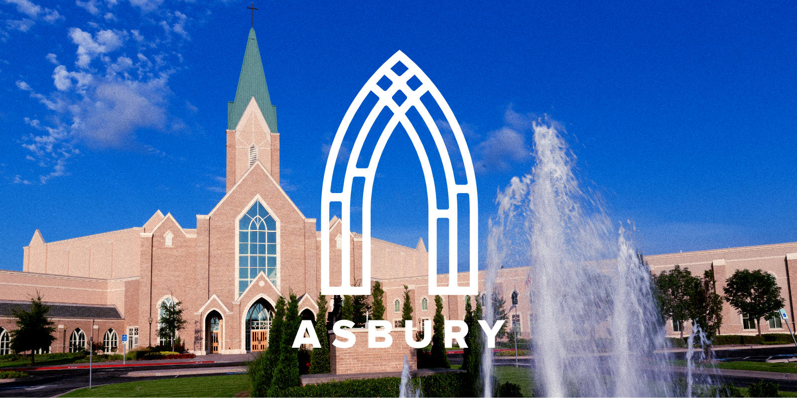
An open door: The foundational concept behind this symbol is two-fold: it stylistically keeps the shape of an “A”, while expanding the context to include the shape of an open door. As a body, the church’s goal is to welcome people; what better symbol than an open door? This reflects the basic message: “Come in! You are welcome here.” The symbol also hearkens to the architecture of the building itself, as there are many doorways of this shape around the campus. There are additional scriptural associations to doors and entrances, such as Jesus being “the way, the truth, and the life. No one comes to the Father except through me.”
Four generations: The symbol is made up of four main columns, representing the four generations that make up the Asbury congregation. Each generation brings something that strengthens the whole: wisdom, experience, energy, vivacity. This is a part of the church’s DNA that is unique and should be highlighted. It is an advantage that brings longevity to the congregation.
Different stages of faith: The four main columns are each split at a different level. This reflects the different stages in our walks with Christ. This is a church with a focus on discipleship and development. Regardless of our experience, the destination is the same: a greater knowledge of and deeper relationship with God. This goal is what the cross-like structure at the top symbolizes. The imagery of stain glass is another architectural call back to its use around the campus.
The symbolism in the logo alludes to an open door, four generations of congregants, and the different stages of a walk with Christ.
Defining the System
Brand Color Options

A church this size requires an extended color palette that could work for numerous ministries and initiatives in multiple combinations. I planned for the possibility that groups of connected ministries might use color-coded versions of the logo to distinguish themselves.
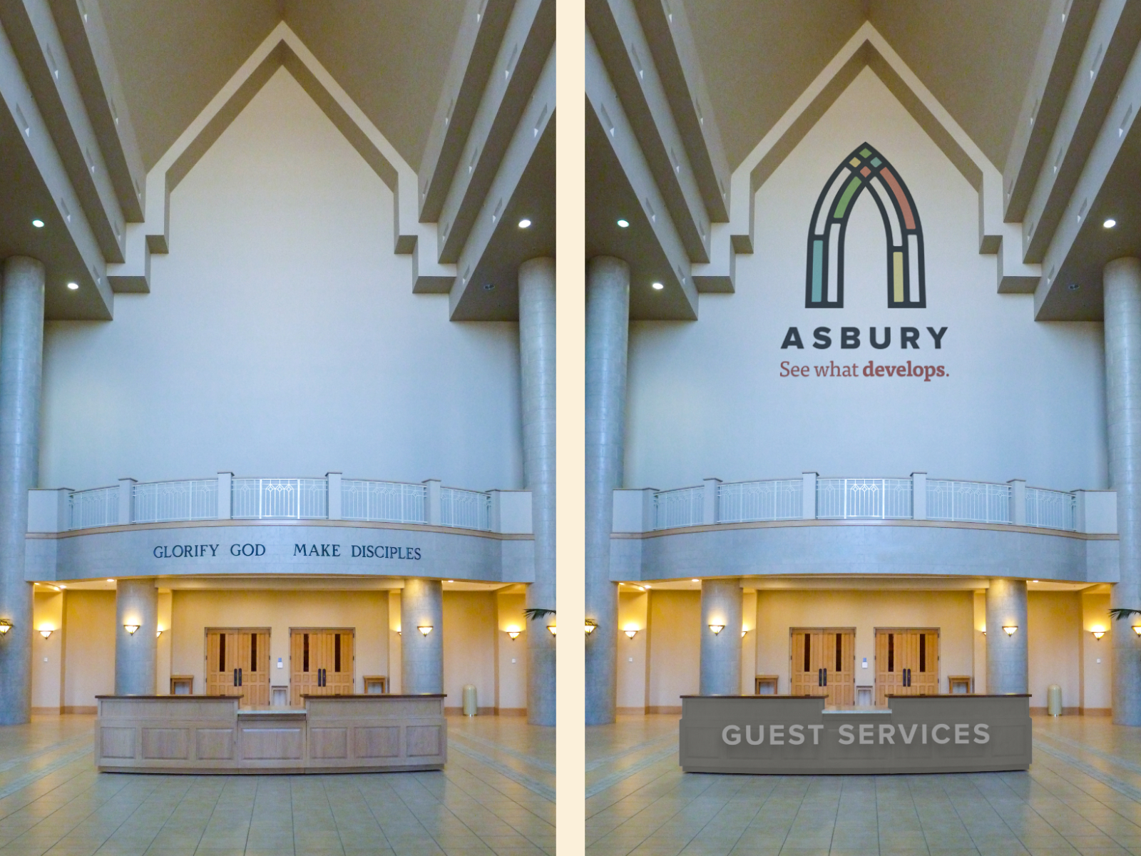
Tag Line
Asbury’s Director of Communications and I were able to work with a great writer to develop a tag line. We needed something that was short, simple, and crisp while being engaging and interesting, flexible but focused.

“See what develops” fit the bill for us. It points to the changes taking place at Asbury and invites the community to take an interest. Asbury’s leadership is very focused on discipleship; this tag line invites people to see what develops in their own hearts and lives by attending Asbury. How will they grow? How will they change?
This tag line invites people to see what develops in their own hearts and lives by attending Asbury.
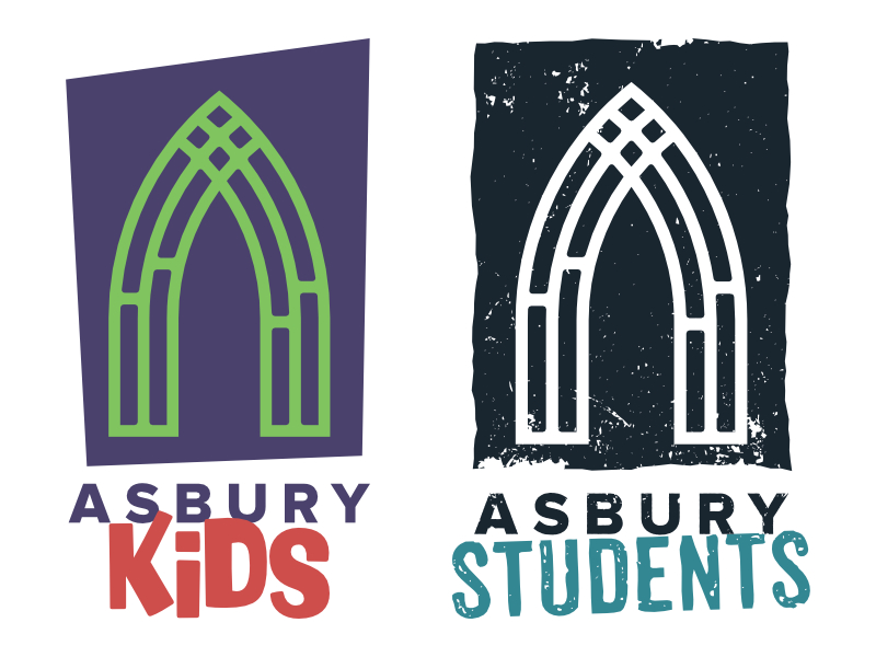
Logo Variations for Ministries
While the main logo would serve to cover most of the church’s ministries, special versions of the logo were developed for the children and youth ministries. The goal was to tie them to the church while giving them some space to be themselves.
Wrap Up
Finding a balance between what would appeal to an audience made up of various age groups took time to accomplish, but the resulting work threaded that needle. We took into account how a congregant who had been going to Asbury for 50 years would view the proposed changes compared to the experience of a first-time visitor. The unifying factor is that every person in the congregation had the same goals: to be part of a community and grow closer to God.